
An end-to-end workflow: from data to PDF
Source:vignettes/end-to-end-workflow.Rmd
end-to-end-workflow.RmdThe getting-started vignette shows
render_onepager() in isolation: a hand-typed list of values
in, a PDF out. That’s accurate, but it skips the part that actually
takes the work in a real project: getting from raw data to that list of
values in the first place. onepagr itself does not include any analysis
code. It never will. Your analysis is your analysis; onepagr’s job
starts once you have results to report.
This vignette walks through all three real steps of a real workflow:
- Run an analysis (here, a small illustrative one, on real public data).
- Shape the results into the named list a template needs.
- Render.
The data
We’ll use USAccDeaths, a monthly time series of
accidental deaths in the United States from 1973 to 1978. It ships with
every R installation (no download, no internet access needed, which also
means this vignette builds the same way on your machine as it does on
CRAN’s check machines), and it’s a genuine surveillance-style metric: a
count that varies over time and is worth monitoring for unusual
periods.
data(USAccDeaths)
deaths <- as.numeric(USAccDeaths)
length(deaths)
#> [1] 72
tail(deaths, 6)
#> [1] 10484  9827  9110  9070  8633  9240
Step 1: Run an analysis
We’ll use syndromic_alert, the template built for “an
observed value crossed a threshold against a baseline” (see the package
README for how this differs from the other four built-in templates). A
real syndromic surveillance system would use a validated algorithm here
(EWMA, Serfling, or a regression/EWMA switch are the standard choices,
per the CDC’s own guidance). For this vignette, we’ll use something much
simpler and fully transparent: for each month, compare it to the mean
and standard deviation of the trailing 12 months, and compute a z-score.
This is deliberately naive; it doesn’t account for seasonality the way a
real algorithm would, but it’s enough to find a genuinely interesting
month in real data without hiding what the calculation is doing.
n <- length(deaths)
z_scores <- rep(NA_real_, n)
for (i in 13:n) {
  baseline_window <- deaths[(i - 12):(i - 1)]
  z_scores[i] <- (deaths[i] - mean(baseline_window)) / sd(baseline_window)
}

alert_index <- which.max(z_scores)
observed <- deaths[alert_index]
baseline_window <- deaths[(alert_index - 12):(alert_index - 1)]
baseline_mean <- mean(baseline_window)
z <- z_scores[alert_index]

cat(sprintf(
  "Largest anomaly: index %d, observed %d, baseline mean %.1f, z = %.2f\n",
  alert_index, observed, baseline_mean, z
))
#> Largest anomaly: index 55, observed 10625, baseline mean 8422.8, z = 2.59
The largest anomaly in this dataset by this simple measure is July 1977: 2.59 standard deviations above its own trailing 12-month baseline. That’s a real, notable jump (not cherry-picked for drama; it’s genuinely the single largest deviation across all 72 months), consistent with a real seasonal pattern in accidental deaths (more outdoor and travel activity in summer).
Step 2: Shape the results into onepagr’s token format
syndromic_alert needs severity_level to be
the literal string "warning" or "critical"
(see ?render_onepager for why this has to be an exact
lowercase string, not an R logical). A real deployment would pick its
own thresholds; here’s a simple, clearly-stated rule:
severity_level <- if (z >= 3) "critical" else "warning"
severity_level
#> [1] "warning"
Now build the full token list. Numbers are formatted with
onepagr::fmt_n() the same way any other project would, and
the narrative/action text is built with
sprintf()/paste() from the real computed
values, not hardcoded, so it stays honest if you change the analysis
above and re-run this chunk.
library(onepagr)

trend_5 <- tail(deaths[1:alert_index], 5)

# USAccDeaths's own time index encodes year + (month - 1) / 12; derive
# real "Mon YYYY" labels from it directly rather than hand-typing them.
time_index <- as.numeric(time(USAccDeaths))[1:alert_index]
year <- floor(time_index)
month <- round((time_index - year) * 12) + 1
trend_labels <- tail(sprintf("%s %d", month.abb[month], year), 5)
trend_labels
#> [1] "Mar 1977" "Apr 1977" "May 1977" "Jun 1977" "Jul 1977"

data <- list(
  doc_title = "ACCIDENTAL DEATH SURVEILLANCE ALERT",
  doc_subtitle = "Illustrative Example . Built from datasets::USAccDeaths",
  org_full = "Example Surveillance Program",
  contact_url = "https://example.org/",
  contact_email = "contact@example.org",
  # Logo tokens are required by every template: these values point at
  # onepagr's own bundled placeholder assets. See vignette("theming") to
  # swap in your own branding instead.
  logo_partner_a_path = "assets/partner-org-a-white.png",
  logo_partner_a_alt = "Partner Organization A logo",
  show_partner_a = "true",
  logo_primary_path = "assets/primary-org-white.png",
  logo_primary_alt = "Primary Organization logo",
  logo_partner_b_path = "assets/partner-org-b-white.png",
  logo_partner_b_alt = "Partner Organization B logo",
  show_partner_b = "true",
  header_texture_path = "assets/header-texture.png",
  severity_level = severity_level,
  alert_condition = "Accidental deaths",
  alert_facility_region = "United States (national)",
  alert_issued_at = "July 1977",
  n_observed = fmt_n(observed),
  n_expected = fmt_n(round(baseline_mean)),
  test_statistic_label = "Trailing 12-month z-score",
  test_statistic_value = sprintf("%.2f SD above baseline", z),
  trend_d4 = fmt_n(trend_5[1]), trend_label4 = trend_labels[1],
  trend_d3 = fmt_n(trend_5[2]), trend_label3 = trend_labels[2],
  trend_d2 = fmt_n(trend_5[3]), trend_label2 = trend_labels[3],
  trend_d1 = fmt_n(trend_5[4]), trend_label1 = trend_labels[4],
  trend_d0 = fmt_n(trend_5[5]), trend_label0 = trend_labels[5],
  narrative_text = sprintf(
    paste(
      "%s accidental deaths were recorded nationally, %.2f standard",
      "deviations above the trailing 12-month baseline of %s. This is",
      "the largest such deviation in the dataset used for this example",
      "and is consistent with a real seasonal pattern (more outdoor and",
      "travel activity during summer months) rather than a data error."
    ),
    fmt_n(observed), z, fmt_n(round(baseline_mean))
  ),
  show_cluster = "false",
  cluster_text = "",
  geo_breakdown_text = paste(
    "This illustrative dataset has no geographic breakdown (it is a",
    "single national monthly count). A real deployment tracking a",
    "metric like this would break it down by state, region, or",
    "reporting facility here."
  ),
  actions_text = paste(
    "- Confirm the finding against a validated surveillance algorithm",
    "(EWMA, Serfling, or similar) before treating it as a real signal",
    "- Compare against the same month in prior years to check whether",
    "this is a recurring seasonal pattern",
    sep = "\n"
  ),
  show_resources = "true",
  resources_text = paste(
    "This is an illustrative example built from public-domain data.",
    "In a real deployment, this section would list your surveillance",
    "program's own contact information or relevant public health",
    "resources."
  ),
  footnote_sources = "datasets::USAccDeaths (R core, public domain)"
)
A note on the trend strip’s period labels
syndromic_alert’s trend-strip section has 5 fixed slots
(the grid itself doesn’t grow or shrink), but what each slot represents
is entirely up to you: the
trend_label4…trend_label0 tokens above are
real values computed from USAccDeaths’s own time index
(“Mar 1977”, “Apr 1977”, and so on), not the fixed “4 days
ago”/“Yesterday”/“Today” text a daily-cadence deployment might use
instead. Real syndromic surveillance in systems like NSSP ESSENCE
routinely runs on daily, weekly, or monthly cadences depending on the
data source, so this section is written to fit whichever one your actual
monitoring interval uses, rather than assuming days specifically.
Step 3: Render
out <- tempfile(fileext = ".pdf")
render_onepager(
  data, template = "syndromic_alert", theme = "default", output = out
)
file.exists(out)
#> [1] TRUE
This is the actual PDF that call produces, built from the real
z = 2.59 finding computed above, not placeholder text:
#> Warning in sprintf(filenames, pages, format): 2 arguments not used by format
#> '/home/runner/work/onepagr/onepagr/docs/articles/end-to-end-workflow_files/figure-html/unnamed-chunk-7-1.png'
#> [1] "/home/runner/work/onepagr/onepagr/docs/articles/end-to-end-workflow_files/figure-html/unnamed-chunk-7-1.png"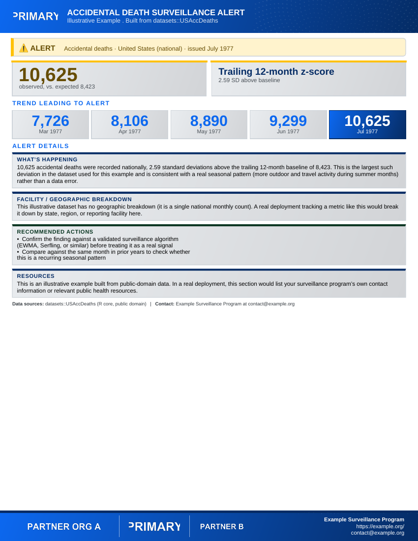
That’s the whole pipeline: real data, a transparent (if intentionally
simple) analysis step, a token list built from real computed values, and
a finished PDF. The only onepagr-specific parts are Step 2’s list
structure and the render_onepager() call; everything else
is exactly the kind of R code you’d already be writing to analyze this
data in the first place.
What you’d change for a real project
-
The data source. Replace
USAccDeathswith your own analysis output; nothing about Steps 2-3 changes. - The detection method. Replace the naive z-score with a validated algorithm appropriate to your surveillance context.
-
The severity threshold. Set
severity_levelfrom thresholds your own program has agreed on, not the illustrativez >= 3rule above. -
geo_breakdown_text,resources_text, andcontact_*. Real geographic detail and real contact information, once you have them.
See ?render_onepager for every template’s full argument
reference, or the package README for the complete list of built-in
templates and which informational shape each one fits.